Worst book covers

I like the smoking one...

LE Modesitt wrote a whole series with appalling covers: can't link them, but if you google 'LE Modesitt book covers' and then press the images button on the left, you'll see some real corkers.

Yes, that helmet is brilliantly designed with a convenient pop-off screen for those pensive, nicotine-infused moments before our Man-of-Action rescues The Girl from the clutches of a horde of B.E.M.s or some deranged megalomaniac bent on destroying the Earth . . . .

Let'a face it: the artist was a hack and the guy who hired him cared even less. Which leads me to the next thought . . . .

Am I the only one picking up on a pattern of condescension amongst this endless stream of god-awful artwork? The science fiction, fantasy and horror genres have always been treated like a literary ghetto by the American publishing industry and nowhere is this attitude more apparent than in these shoddy covers. Sure, things improved after Star Wars proved the genre could be a cash cow, but the stigma lingers on like a musty odour.

On the topic of Mr. Modesitt's covers, I see many Darrell K. Sweet illustrations represented. I respectfully disagree with the verdict of some folks on this thread about Mr. Sweet's art. Yes, his characters are a little strange looking, but that is stylistically intentional. I agree that some of his later stuff lacks dramatic tension, but I see this disagreement largely as a mere divergence in taste, nothing more. As we've seen, there are far worse transgressors operating out there in the cold vacuum of the publishing industry.
 
I think I'm with the majority - having checked out lots of these covers by Sweet, I've reached a personal conclusion that they are uniformly awful! I think Sweet clearly struggled when it came to drawing people. I'm astonished he was commissioned so often. His landscapes and architectural backdrops are fine.

Interestingly, I came across a Jack Vance cover that reminded me of the first cover that I, Brian posted, regards the standing man in a shirt. Except in this picture, there's a sense of animation and tension in the figure. The contrast is startling: http://www.goodreads.com/book/show/10791046-dangerous-ways
 
My personal worst covers are Jack Campbells Lost Fleet covers - the American ones:
lflg.jpg

This is a book about the admiral of a space fleet who never leaves the flagship and (as far as I remember) never actually picks up a gun. The UK cover is a bit more meaningful:
the-lost-fleet-3-Jack-Campbell.jpg
 
Excellent example. The UK cover is kind of blandly conventional, but fine - the US covers drive me nuts. Not just bad or wrong, but bad and wrong.
 
Yeah there were some USA based people on here specifically stated they hadn't tried those books purely because of the covers! Interesting to note that I did have a short email conversation with Jack Campbell (well John Hemry actually) and he also preferred the UK covers and hated the USA ones, but apparently the publishers weren't particularly interested in his opinion on them. I believe they also had the final say on the book titles as well.
 
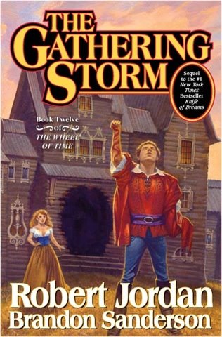
the_gathering_storm_cover1.jpg


When I saw the title this immediately sprung to mind. Surely this is the worst Wheel of Time cover. Everything is crooked and it looks like an 8 year-old drew it. I laughed out loud the first time I saw it in the bookstore...
 
Hah, poor Wheel of Time covers. I had the first book with the lame cover and because I'm That Kind of Person who hates having a series with mixed styles, every time I buy the next one, it has to be with those style of covers. They're...unique, at least ;)
 
The question must be: why are there so many examples here of bad artwork? Surely, there must be as many struggling artists out there as there are struggling writers, all who would die for a break. Or, is that the reason: did the writer just ask their 'mate' to do it? 'You could draw better than me at school, do this cover and I'll buy you a drink.'

I can't see things improving with photographs though. if you use a favourite search engine and look for 'photoshop disasters', then you'll see what I mean - even among professional, well-paid marketing campaigns.
 
Perhaps it shows a publisher's attitude towards our genre?
 
Nerds Feather, I have The Caverns of Kalte! [For reasons which are strange and mysterious I actually have two copies].

Early Lone Wolf books did have ropey covers, but they were tremendous fun.
 
I thought they'd be a dedicate place for displaying the worst book covers that SF can offer - and I have at least found one:

http://www.goodshowsir.co.uk/

So If you have an hour or two to waste...


...I've already discovered 'unimaginable demensions' on page 2...
 

Similar threads


Back
Top