New cover for Teresa Edgerton's Goblin Moon

Gary Compton

I miss you, wor kid.
Joined
Jul 8, 2007
Messages
3,247
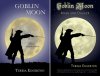
Well after a week of being the sausage in a Teresa and Leisha meat sandwich, improving, altering, enhancing, going forward, backwards and then forward again. The new cover for Goblin Moon is finished.

No pain no gain they say so it was all worth it!:D

Well done to Teresa in helping us take it to the next level.:)

I hope you agree it is top class!

Now before I go and have a lie down here it is:

Goblin%20Moon-pressrelease.png
 
Very nice. Is it just a different font? I like the font on the title. Dead snazzy.
 
No its completely different to the original, same scene but all new and improved :)

See original here.
 
Thanks guys, we are working on Hobgoblin Night and are nearly there. Leaving it till next week to finalise :)
 
Leisha (under Gary's guidance) did a lot of things that add up to make the cover, in my opinion, so much better.

In fact, of all the book covers I've ever had, I love this one best.

And I agree, Mouse, the font is snazzy.
 
Leisha (under Gary's guidance) did a lot of things that add up to make the cover, in my opinion, so much better.

In fact, of all the book covers I've ever had, I love this one best.

And I agree, Mouse, the font is snazzy.

Thanks Teresa. Like my avatar says, I am the cement that holds it together.:)

Leisha did an amazing job turning ideas into reality. I am sure she'll be along shortly to comment and of course the inspiration would not have been possible without a beautifully written tale.:D
 
Ooh!!! Yay, it's up! VERY glad to see it out there. :)

I had lots of fun with it, and it makes THRILLED TO BITS(!!!) that Teresa likes it so much. It makes all the effort worth it.

A side-by-side:

attachment.php
 

Attachments

  • TEside-by-side.jpg
    TEside-by-side.jpg
    98.1 KB · Views: 249
Last edited:
Very nice! I see the dude is more detailed and sharper, too.

And it also says nice things about Teresa, which has to be good. :D
 
Well spotted, TDZ! Yes, I created a vector out of the original silhouette, then fixed the parts that needed it, with the result that he looks much sharper and much more as the author intended. :)
 
That's a fine cover and a definite improvement.

Technical query: what's the reasoning behind not placing the quote 'aligned centre'?
 
That's a fine cover and a definite improvement.

Technical query: what's the reasoning behind not placing the quote 'aligned centre'?

It's aligned right with Teresa Edgerton, the technical term is Gary Alignment LOL
 
Heh! Yes, that got my OCD at first, but when I tried to centre it it looked... wrong, because the author name is to the right. I'm waiting to see if anyone else has problems with it, cos atm I've got used to it like that. Plus, at the time of creation I didn't know if everyone would want that exact quote and if I'd have considerable changes to make to it anyway. :)


Edit: Gary Alignment! I like that. You're definitely aligned differently. :D;):D
 

Similar threads


Back
Top