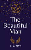
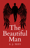
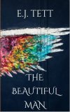
Which cover?

Mouse

Well-Known Member
Joined
Jun 2, 2006
Messages
10,730
Location
Devon
Thinking of self-publishing TBM because it seems a shame for it to just sit inside my laptop doing nothing. I'd only ebook it. I'm currently re-writing it (my 're-writing' is basically fiddling). Instead of doing any work on the actual story right this second, I've been messing about with making covers. I know which one I prefer, but what do you guys think? (Especially the old beta-readers!)

Black and White Minimalist MemoirInspirational Book Cover.jpgTBM cover.JPGThe Beautiful Man.pngThe Beautiful Man1.pngThe Beautiful Man2.png
 
1 - not keen on. Not like the Ambrose I imagined
2 - like a lot
3 - also like
4 - is good but I don’t think says the right genre
5 - too much of a spoiler

For me 2 is my fav
 
I kinda like the red one. The first one looks like a back cover, 'about the author' blurb instead of a front cover. In the second one, the colored flag seems to jump out and distract from the title. I think the last three work well enough, but the red really grabs my eye.
 
Like Jo, I much prefer #2. I'm intrigued as to what the image means in the context of the title. But I'd change the font for something less fiddly (in particular, the curls on the double-T in your surname don't work well IMO -- on a trad-pub book the top bars would run together). I think it also needs a bit more gap between the edge of the wing and the "the".

BTW, there seems to be a vertical "ridge" down the RHS. Is that deliberate?
 
Quite difficult to say without knowing the genre, tbh.

1. looks like romance / YA
2. looks like urban fantasy - the title font is too close to the bottom of the image and "the" is too close to the wing
3. could be horror, but the font looks chick lit
4. looks YA / witchy fantasy / Neil Gaiman, to me.
5. Looks like it belongs in the horror genre
 
1 - not keen on. Not like the Ambrose I imagined
2 - like a lot
3 - also like
4 - is good but I don’t think says the right genre
5 - too much of a spoiler

For me 2 is my fav
Yep, no. 1 doesn't look like Ambrose at all. No 5 is a spoiler, I agree.
Like Jo, I much prefer #2. I'm intrigued as to what the image means in the context of the title. But I'd change the font for something less fiddly (in particular, the curls on the double-T in your surname don't work well IMO -- on a trad-pub book the top bars would run together). I think it also needs a bit more gap between the edge of the wing and the "the".

BTW, there seems to be a vertical "ridge" down the RHS. Is that deliberate?

Ta. The image is of two wings but I've just pushed it right over as for some reason the programme I used (which is different than for the other four) won't let me shrink the image, it'll only let me shift it left or right. I can't do anything about that ridge. No. 2 is also the only one out of the five I'd have to pay for. Heh. I can play with the font.

Quite difficult to say without knowing the genre, tbh.

1. looks like romance / YA
2. looks like urban fantasy - the title font is too close to the bottom of the image and "the" is too close to the wing
3. could be horror, but the font looks chick lit
4. looks YA / witchy fantasy / Neil Gaiman, to me.
5. Looks like it belongs in the horror genre

I don't really know the genre myself! Sort of urban fantasy, I suppose.

Here are my thoughts:
No 1: I made in two seconds as a placeholder cover to use on RoyalRoad. It's meh.
No 2: My joint fave but I'd have to pay for it and I wasn't sure if it fit the genre, but Mon0Zer0 saying urban fantasy makes me think it's ok.
No 3: Hate. Too black.
No 4: I agree with Jo. (Although Neil Gaiman-y would be excellent)
No 5: My other fave. Just wondering if I can get over the spoiler

Is this better?
.Capture.JPG
 
Last edited:
I like the original cover 2 better, although both look good. I can see your name better in the original, and the color contrast seems stronger to my eye, but you should also probably ignore my eye, as it usually sucks. Love the font.
 
Not the expert that most of you are, but I like #2 best. In the first #2 it hinted at "gay romance" which knowing some of the stuff you write, maybe what you intended. #2 on the second go, doesn't say that as much to me.

#5 says "This beautiful man is an angel." Which if it's a spoiler he probably is.
 
Third edition of #2 looks less gay romance to me, but I'm not sure why.

Perhaps because it looks less like a rainbow? I sorta like the ridges, it gives it a wooden picture feel and therefore less a spoiler.
 
Might be the rainbow coloured wings. The MC is straight in this one, though there is a rainbow cast.
 
Having read this I'd say 3 and 5, but you hate 3 (?!). What I wanted to say was even though I've read it, it didn't even occur to me about the spoiler. IMO it looks the most professional, although perhaps slightly reminiscent of the Jesus Christ Superstar logo. Dunno wht you hate the black one.

To be honest, all except the purple one look like they'd do very well. I think the 1st doesn't necessarily scream YA but it looks a little more like a movie poster than a book cover. The purple one looks like a box for a tarot deck. I wonder if the rainbow might be a bit too promisey for something that isn't pure LQBTQIA

Pretty nice work though.

Div

3 looks too dark in the thumbnail, I think.

I was going for more along the lines of this for 5:
66717._SY475_.jpg


I don't want any of them to look YA or romance-y as it isn't either. Maybe I should carry on re-working it before I worry about the cover.
 
I like all of them except the first (left most) one. I think the last (#5) is the best.
 
Mouse said:
Is this better?

Yes. I'd certainly pick this one up and look at the first couple of pages - and that's the first step, isn't it? ;)

Capture.JPG


If you kept the wing the original way around, though, couldn't you wrap it across the spine and mirror it on the back cover?
 
Small thing but the wing is a triangle, which form wise indicates danger, anger, speed, tempo. It also has movement, pointing in a direction. Is that a feeling you want to convey? Also, if it is to show direction, perhaps point right? That invites to open the book.
 

Similar threads


Back
Top