I had an idea for a cover that I liked, and I had someone rough it out in pencil. This is the basis for the grey-ish image. Originally I was going to have it coloured like the super-rough mock-up, but I quite like the near-monotone one. However, it doesn't work at present as a thumbnail because all the snake outlines blend into a mess. I'd be grateful for people's opinions on whether the idea works well as a cover, and what maybe I should do with it. (Ignore the lettering, it's just a placeholder font.)


You are using an out of date browser. It may not display this or other websites correctly.
You should upgrade or use an alternative browser.
You should upgrade or use an alternative browser.
Goddess Project cover concept redux
- Thread starter HareBrain
- Start date
Ray McCarthy
Sentient Marmite: The Truth may make you fret.
The left one works (but needs refined only slightly)
The right could be seaweed on a porthole, or I don't know what! The figures on the right one look out of place. The face doesn't quite work.
If I didn't know anything about the book, and the white figures didn't exist, then in general the right cover nearly works, but the wormy shapes too blurred.
Just my own reaction.
- Joined
- Mar 3, 2014
- Messages
- 3,296
Hey HB! I asked my wife to help, as she is much wiser than I am. ") I gave her a blurb-like explanation of the story (as you might find on the back cover of the book), and asked for her opinion on the covers. She and I both agreed that if we were looking at books in a bookstore, the right cover would more effectively draw our attention (these are, or course, mock-ups, and we agreed that if the right was finished..polished..it would have us both very interested in the book).
I gave her a blurb-like explanation of the story (as you might find on the back cover of the book), and asked for her opinion on the covers. She and I both agreed that if we were looking at books in a bookstore, the right cover would more effectively draw our attention (these are, or course, mock-ups, and we agreed that if the right was finished..polished..it would have us both very interested in the book).
I also went through and found the old cover mock-ups from your thread of last year, an she prefers the cover on the right here, just above, to the older ones, as well. Good luck! CC
I gave her a blurb-like explanation of the story (as you might find on the back cover of the book), and asked for her opinion on the covers. She and I both agreed that if we were looking at books in a bookstore, the right cover would more effectively draw our attention (these are, or course, mock-ups, and we agreed that if the right was finished..polished..it would have us both very interested in the book).I also went through and found the old cover mock-ups from your thread of last year, an she prefers the cover on the right here, just above, to the older ones, as well. Good luck! CC
J Riff
The Ants are my friends..
Maybe a few less tentacles, larger ones, would show up better. The grey one is the best of these two because the dark one looks... too dark. But the eyes, if you could put them on the monotone one, might be it.
The one on the left seems to have a clearer focus - if the tentacles around it were less even and more varied in length and thickness, IMO that would work even better.
I think the general concept here is your best bet yet. My gut says the one on the right -- the aquamarine of the face conveys so much. But the tentacles do look like seaweed. As is, it's nicely claustrophobic, but if you got them more ... tentacley ... even you might be happy
Thanks for the comments.
I DREW IT WITH A MOUSE!!!
Thanks -- that was what I originally had in mind, but the artist went with a swarm effect (the ones at the top are snakes, by the way). I like the swarm at full-size, but I think it needs some big specimens to be effective as a thumbnail.
I'll see if I can get some shade and colour into the snakes and try to transfer the blue face to the more polished version and see how that works. It seems that most people like the face in the background -- is that a fair assessment?
The right could be seaweed on a porthole
But the tentacles do look like seaweed
I DREW IT WITH A MOUSE!!!
Maybe a few less tentacles, larger ones, would show up better
if the tentacles around it were less even and more varied in length and thickness, IMO that would work even better
Thanks -- that was what I originally had in mind, but the artist went with a swarm effect (the ones at the top are snakes, by the way). I like the swarm at full-size, but I think it needs some big specimens to be effective as a thumbnail.
I'll see if I can get some shade and colour into the snakes and try to transfer the blue face to the more polished version and see how that works. It seems that most people like the face in the background -- is that a fair assessment?
I really like the face on the right and think you should include it, but I much prefer the way the snakes and tentacles are rendered on the left. I think the picture on the left would be boring unless the figures of Orc and Cass were significantly larger. If you are going to do the face, the figures, and the snakes and tentacles, I think you need fewer snakes and tentacles, or the effect will be too busy.
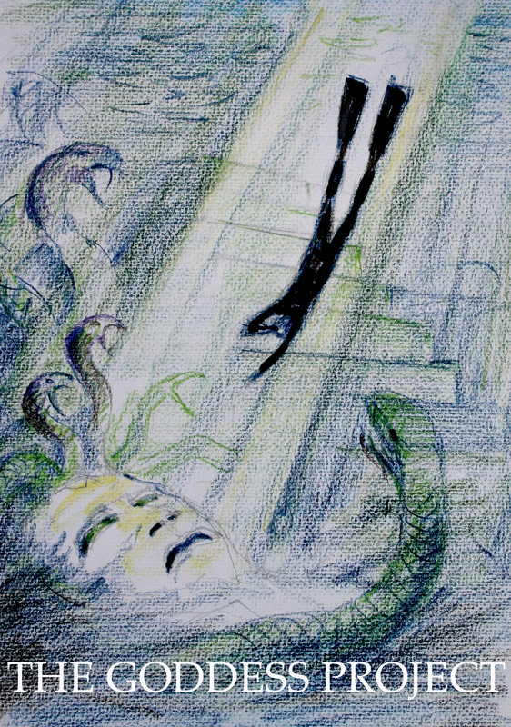
OK, here's my attempt to merge the two. As a rough, does it work? I accept the comments about needing fewer and larger squirming things. Would it be better or worse if the face looked less obviously like a face and more a suggestion of a face made by things on the sea floor?

Ray McCarthy
Sentient Marmite: The Truth may make you fret.
That's much better.
The face is fine.
The squirmy things nearly fine.
The swimmers (Orc and Cass?) maybe slightly larger and not just white silhouettes
The face is fine.
The squirmy things nearly fine.
The swimmers (Orc and Cass?) maybe slightly larger and not just white silhouettes
The swimmers (Orc and Cass?) maybe slightly larger
I did try making them bigger (see below), but I think it makes them look less threatened. What do others think?
and not just white silhouettes
Were you thinking full-on realistic colour, or something else? I think the white silhouettes contrast well with the background (esp at small size) but I'm happy to hear others' opinions on this.
- Joined
- Mar 3, 2014
- Messages
- 3,296
I think this shows real potential, HB. Just a few thoughts/opinions...
--I love the tentacles in this newest version of the cover--the suckers are clearly drawn in, and make it clear that these are tentacles; I hope with a more finished version of the cover that the creatures on top are very clearly drawn as snakes...I think otherwise people may just assume they are more tentacles.
--I think I prefer the smaller divers in the picture posted at 12:06pm.
--about the face; my personal preference would be for a more stone-like/hag-like, threatening visage; something more like the face from this earlier sketch:
 .
.
That's actually a beautiful face in the current version of the cover, and I'm not sure that best suits the story. Just my 2 cents...but it's potentially a very exciting cover! CC
--I love the tentacles in this newest version of the cover--the suckers are clearly drawn in, and make it clear that these are tentacles; I hope with a more finished version of the cover that the creatures on top are very clearly drawn as snakes...I think otherwise people may just assume they are more tentacles.
--I think I prefer the smaller divers in the picture posted at 12:06pm.
--about the face; my personal preference would be for a more stone-like/hag-like, threatening visage; something more like the face from this earlier sketch:
That's actually a beautiful face in the current version of the cover, and I'm not sure that best suits the story. Just my 2 cents...but it's potentially a very exciting cover! CC
Ray McCarthy
Sentient Marmite: The Truth may make you fret.
The face is lovely now.
The swimmers good size. Maybe a slight grey / blue tint darker than cheeks of face so they seem more underwater instead of looking as if part of the title on top of page.
The swimmers good size. Maybe a slight grey / blue tint darker than cheeks of face so they seem more underwater instead of looking as if part of the title on top of page.
I assumed that in the final version the figures of the divers would be more realistic and in realistic colors. As it is now, we only know what they are because we already knew who they are. To me they look like rag dolls.
I assumed that in the final version the figures of the divers would be more realistic and in realistic colors.
Originally, the swimmers were going to be without fins, the idea being that the cover symbolically showed their life-situation generally rather than illustrating any particular part of the story. I might revisit that idea and see how that looks. I'll try a version with the divers coloured, too, to see how that works, but my fear is that they'll be completely lost against the background at thumbnail size.
Here's a coloured-diver version. Does anyone prefer it to the white silhouette?

Last edited:
Ray McCarthy
Sentient Marmite: The Truth may make you fret.
Looks great now!Here's a coloured-diver version. Does anyone prefer it to the white silhouette?
The White silhouette would be OK for text or a logo, but not for the divers, makes them too separate from the image. Too much contrast.
EDIT:
Now maybe a skinnier aspect ratio font for the title.
I think the Title and Author can sometimes be different fonts, even though generally in Graphic design a single font is preferable. But a Title or Chapter Heading can always be a different font.
Hmm, I hope it doesn't get stuck at a one-all tie!
I think the contrast works better at thumbnail size:


That lettering was always going to be temporary. The artist who did the rough does some nice hand-drawn lettering, and I'm thinking of going for that, just to be different. Save me having to sort through 17678 fonts.
I think the contrast works better at thumbnail size:
That lettering was always going to be temporary. The artist who did the rough does some nice hand-drawn lettering, and I'm thinking of going for that, just to be different. Save me having to sort through 17678 fonts.
Ray McCarthy
Sentient Marmite: The Truth may make you fret.
Makes them very ghost like and in the foreground on the thumbnail having white. Maybe on thumbnail I'd do a combination of two tricks:
1) Crop slightly so centre space and figures are not so small
2) Try increasing size of figures maybe 10% too
But even as it is I prefer the right not-ghost version. My screen is about 133dpi, so only HD phone screens or retina tablet screens at native are going to have much smaller thumbnails.
(I preview stuff on several different devices, but it's all web sites really, not book thumbnails, though one site has book thumbnails produced by others.)
| Thread starter | Similar threads | Forum | Replies | Date |
|---|---|---|---|---|
|
|
THE GODDESS PROJECT in Fantasy-Faction's Top 50 Fantasy Books of 2017! | Bryan Wigmore | 6 | |
|
|
Goddess Project; Bryan Wigmore | Bryan Wigmore | 19 | |
|
|
The Goddess Project -- Virtual Book Club Discussion | Bryan Wigmore | 5 | |
|
|
The Goddess Project by Bryan Wigmore | Bryan Wigmore | 31 | |
|
|
The Goddess Project cover reveal | Bryan Wigmore | 38 |
Similar threads
-
 THE GODDESS PROJECT in Fantasy-Faction's Top 50 Fantasy Books of 2017!
- Started by The Bluestocking
- Replies: 6
-

-

-
-
