New edition of A GAME OF THRONES

Werthead

Lemming of Discord
Joined
Jun 4, 2006
Messages
2,185
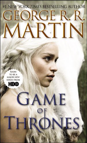
Bantam have unveiled the cover art for their new, tie-in edition of A Game of Thrones, due for release on 22 March ahead of the TV show's debut on 17 April (the promo material says 24 April, but this has since changed).


The cover art depicts Emilia Clarke as Daenerys Targaryen, a photograph originally released as the second piece of promo material for the series many months ago.

My understanding is that this new edition will complement existing editions of the book, not replace them (although new printings of the books will apparently be amended to note the HBO series' existence). I assume that this is the cover art Voyager will be going with in the UK as well. The Voyager edition is not just new cover art, but will feature a whole new, 'cleaner' typeface and will be a larger, B-size mass market paperback. Whether the American edition gets the new typeface as well is unclear at the moment, but the US edition will be available in both tradeback and mass-market paperback.
 
Interesting. I'm not a fan of books with covers to tie-in with movies and TV shows and whatnot. Kinda makes them look like DVDs.
 
Looks good, I think better than the monochromatic dragon, helmet, chalice designs. I saw the extended trailer and I reckon I need to get AGOT very soon because that trailer (even though it it is a TV series) looks amazing (almost like an epic feature film) and got the juices flowing in my mind, I am seriously considering getting the first book and just going for it. I really like the first 2 books in the First Law trilogy and as mentioned in these forums that if you like Abercrombie you will most likely like GRRM's ASOIAF.
 
Wow, that is really underwhelming. Of all the great stills I've seen so far, that's a really ordinary and non descriptive pic....
 
I think it's a mistake. On first glance, to me, it just says "unicorn fantasy". I'd probably skip over it if I didn't already know what it was.
 
I recently turned down the chance to buy the first book in Pullman's Dark Materials trilogy. Why? Because it had the film-related cover...

I just hope this new edition doesn't mean less prints of the others.
 
Interesting. I'm not a fan of books with covers to tie-in with movies and TV shows and whatnot. Kinda makes them look like DVDs.
^^This.

Also gives the "why should i read a book about something i can see on the screen anyway lulzulz" feeling too :D
 
I think it's a mistake. On first glance, to me, it just says "unicorn fantasy". I'd probably skip over it if I didn't already know what it was.

This.

Might have been forgiven if it was a battle scene or something, but Dany? Really?
 
I must say, I find the cover incredibly attractive.
Would I buy the book if I didn't know anything about
ASOIAF, and just happen to see it at the store?

Probably not.

I've walked right by dozens of novels that look just like it.
 
I may have spoken too soon. The 'normal' American editions are also being replaced with the UK cover art from 22 March onwards:

New%2BGame%2Bof%2BThrones%2BCovers.bmp


Oddly, they're using the UK ADWD cover for AGoT, presumably because AGoT has a dragon skull on it, which Bantam may prefer to have on ADWD.
 
I think it's a mistake. On first glance, to me, it just says "unicorn fantasy". I'd probably skip over it if I didn't already know what it was.
I won't ask why you imagined you saw a horn on that horse.
 
I must say, I find the cover incredibly attractive.
Would I buy the book if I didn't know anything about
ASOIAF, and just happen to see it at the store?

Probably not.

I've walked right by dozens of novels that look just like it.

Agree.

I have these editions and love them:

thrones04.jpg


kings01.jpg


swords13.jpg
 
Hate when they put movie scenes on cover, today it turned me off from buying Solaris (it had george cloney on it). Books and movies always have to have enough space among them, cause if movie fails u don't want to have scene from in on ur favorite book. Not a fan of the UK covers also, crowns, sword to simplistic and never goes with background colour (taking a risk of appearing gay fashion advisor)
 
thrones03.jpg


This is the style I have for the first three books. I had to get Feast in TPB, with the plain red cover and the cup. Never continued this design past Storm, unfortunately....
 
The TV tie-in cover art is apparently not final. HBO and Bantam are still debating designs, and the Dany one is a placeholder.
 
thrones52.jpg


Now that is a cover. Though I really like the simple looking ones too.
 

Similar threads


Back
Top