60s-70s American paperback cover typography question

Extollager

Well-Known Member
Joined
Aug 21, 2010
Messages
9,046
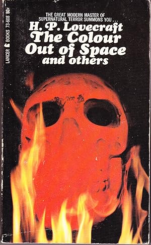
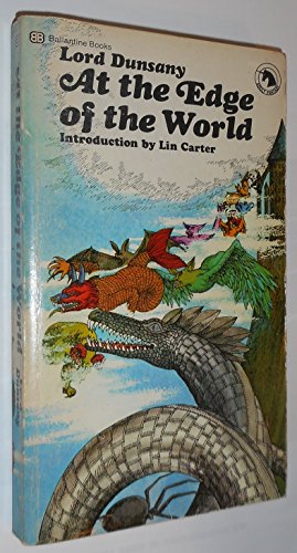
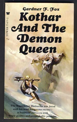
Does anyone know what the principal typeface shared by these books is called? Some kind of Italic, I take it, but what?
9780345018793-us.jpg
md22301408005.jpg
073384091b2b4c17476036cd34a43794.jpg

md31213714986.jpg
13876664.jpg
s-l500.jpg
 
I like it, but I have no idea. It's obviously meant to look old, but it is rounder and more modern-looking than any of the Chancery or Calligraphy fonts that I'm familiar with.
 
Does anyone know what the principal typeface shared by these books is called? Some kind of Italic, I take it, but what?
9780345018793-us.jpg
md22301408005.jpg
073384091b2b4c17476036cd34a43794.jpg

md31213714986.jpg
13876664.jpg
s-l500.jpg
I believe it is

Cooper Black Swash Italic

newer digital version is Umbriago NF

BTW somewhere on copyright page there may be a listing that identifies the typeface

 
The The in The Master of Blacktower is different from that in the other book covers, so it seems there was at least this much variation in what is, surely, otherwise the same typeface.

Thank you, Snicklefritz!
 
The The in The Master of Blacktower is different from that in the other book covers, so it seems there was at least this much variation in what is, surely, otherwise the same typeface.

Thank you, Snicklefritz!
There are quite a few variations on Cooper typefaces
 
Perhaps more than you want to know, but interesting -- Fat Face: 100 years of Cooper Black
Looks like the author here was wrong about the Beach Boys ushering the typeface into popular use, since the Man from U.N.C.L.E. paperbacks began in 1965, to the Beach Boys' 1966.


1685127352877.jpeg

Ace didn't use Cooper Black Swish Italic for the first novel, but did on the second and its successors, 1965 on. Note the Th in The, as in The Master of Blacktower. I don't know the dates of some of those old Gothics. The U.N.C.L.E. books are the earliest ones I'm sure of.
 
Looks like the author here was wrong about the Beach Boys ushering the typeface into popular use, since the Man from U.N.C.L.E. paperbacks began in 1965, to the Beach Boys' 1966.


View attachment 104587
Ace didn't use Cooper Black Swish Italic for the first novel, but did on the second and its successors, 1965 on. Note the Th in The, as in The Master of Blacktower. I don't know the dates of some of those old Gothics. The U.N.C.L.E. books are the earliest ones I'm sure of.
Hey, wadda I know? I'm just going back to my California case days lol Curious tho' if you found any info on the copywrite pages? Or do you just collect covers? (not a snarky question -- inquiring minds want to know)
 
Snicklefritz, I own only the Dunsany book and a couple of U.N.C.L.E. books with the typeface, and I'm sure they don't have a note such as you mention. I don't think American paperbacks of that era did that, though of course exceptions are possible. The photos I've posted have all been from internet sources, not my own collection.

So strong was the association of Cooper Black Swash with Gothic that when comics took up the genre..... That's CBS, isn't it? Or something very close.
e20b0eca114b75bd0edbfa1b4a8f24d2.jpg
5534427.jpg
 
Here's Ace using it for an Edgar Rice Burroughs imitation.
100e897ff4f2f0be418cbb261150bb57.jpg

And for one of Lin Carter's books.

36dde516335c458ab366185924dda368.jpg
 
And a Beatle's first solo album.
8627548b22b524bc509508cbd592e760.jpg

My vague impression is that the typeface we have been discussing was favored by American publishers, while I don't remember seeing it used in any British production unless the McCartney album typography was British. David Puttnam chose the picture of McCartney and infant daughter, but I have no reason to think he chose the lettering. Now, was this an Apple design -- London personnel? Or could it be that, through Linda, McCartney had a connection to an American design agency? Unimportant really, but I wonder. In any event, this LP was one of the very first pop music records I ever owned, and I must at some level have associated that typography with the Ballantine Dunsany paperback, etc. -- because I did notice such things, of that I am sure.
 
Last edited:
This has the feel of lots of late 60s/early 70s popular media typography. I think this general style was pretty ubiquitous for a while before going out of fashion.
 
Does anyone know what the principal typeface shared by these books is called? Some kind of Italic, I take it, but what?
9780345018793-us.jpg
md22301408005.jpg
073384091b2b4c17476036cd34a43794.jpg

md31213714986.jpg
13876664.jpg
s-l500.jpg

I had that exact edition of Dunsany's stories. I don't only have that edtion of Kothar but I do have A 5 book series of Kothar stories by Fox . Ive never read any of the Uncle books , I think owned that Lovecraft book but a different editions.

Have never heard Dorthy Daniels:unsure::confused:
 

Back
Top