You are using an out of date browser. It may not display this or other websites correctly.
You should upgrade or use an alternative browser.
You should upgrade or use an alternative browser.
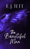
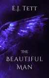
Which cover?
- Thread starter Mouse
- Start date
To my eye the wing looks better with the tip to the right and reaching nearly all the way across the cover, which means you might need to slim it down a touch.
It doesn't say urban fantasy to me but the consensus might disagree.
Good luck!
It doesn't say urban fantasy to me but the consensus might disagree.
Good luck!
Ok, there's been a spanner thrown in the works by my husband who I've just shown the covers to on my laptop. He doesn't know the story. He spent a solid five minutes ranting about how bad the various versions of cover number 2 were - saying they were old fashioned, or looking like it was something to do with a Netflix David Attenborough climate change special. Then he asked 'who designed these anyway?' to which I replied, 'I did, dear.'
He said number 5 looked like a horror.
His fave was number 4, which he said looked like a supernatural story.
My dilemma is that even though he's not a fiction reader and you guys are, it is a supernatural story. But if number 2 attracts the most people, then that's what you want from a cover, right?
IMO the publishing package (cover, title, author name, blurb and book) all need to be consistent and aligned to the genre.
If the cover is inconsistant with the story then you'll attract people who don't want to read it so either they don't buy it or they are disappointed. Equally, you miss the opportunity to attract readers who do want to read the book but think it's a different genre so don't click on it.
Just my view though...
Two is the best one, but the vertical distance between the three lines of the title are much too big. Needs compressing.
Also, the symmetry of the title doesn't match the asymmetry of the wing. Take the 'the' to the left to balance. Monzero's third example is getting there.
Also, the symmetry of the title doesn't match the asymmetry of the wing. Take the 'the' to the left to balance. Monzero's third example is getting there.
That's really nice! I think the visibility of the wing needs raising - use the levels function to raise perceived contrast and brightness. The "handwritten" title looks ace. Normally I'd say don't mix fonts on title and author name, but this works. Maybe try your name in a sans serif font to match?
I looked at the initial 5 covers and liked the red one the most - I've not read all the comments. Just liked it the most as a clear image which was striking. I can see your husband's point about horror though, now it has been mentioned as red and black is used for horror quite a bit - but it wasn't the first thing that sprang to mind for me.
With the blue ones, I like them once I look at the large version - so they work full cover but not as a thumbnail - more contrast is needed.
With regard to the text, I don't like the slightly scribbly hand written font for the title and in terms of your author name I prefer the larger all caps version you are using on the right hand one.
I haven't read the book - one other comment would be that handwritten-ish titles tend to suggest romance, so don't know if that is good or bad for your book.
Yes for me it is also cover design 2. The font needed enlarging for the title, which you have done in the later revisions but the font needs to be 'glance legible', not quite so elaborate with the B and N.
Version one of the revisions is best but Don't have your name in bold where the title body isn't. It feels a little top heavy as is.
Version one of the revisions is best but Don't have your name in bold where the title body isn't. It feels a little top heavy as is.
Gah! Ok, I've upped the contrast & brightness on the newest version, left the 'scribbly' title even though Montero doesn't like it because I think it looks more interesting and used a sans serif font for my name but urgh... I dunno. No matter what I do my name looks stupid. I think it's all the Ts. I can't help that unless I use my married name (though that's got a double B), but all my writing/authory stuff is done in my original name.


I really like the purple, the lighting and the wreathing "smoke"! I'm not sure it's very obvious it's a wing at thumbnail BUT if I came across it I would definitely click to see what it actually was.
I think your name in that font is fine. Unlike Stephen, I'm not massively keen on the "handwritten" title. Partly this is because it strongly suggests self-published (though I've seen some trad covers that do the same!) and maybe romance, but also it feels a bit at odds with the sumptuous, velvety feel of the image. OTOH it wouldn't actually put me off investigating further.
I think your name in that font is fine. Unlike Stephen, I'm not massively keen on the "handwritten" title. Partly this is because it strongly suggests self-published (though I've seen some trad covers that do the same!) and maybe romance, but also it feels a bit at odds with the sumptuous, velvety feel of the image. OTOH it wouldn't actually put me off investigating further.
Unlike Stephen, I'm not massively keen on the "handwritten" title. Partly this is because it strongly suggests self-published (though I've seen some trad covers that do the same!) and maybe romance, but also it feels a bit at odds with the sumptuous, velvety feel of the image. OTOH it wouldn't actually put me off investigating further.
Ack, really? I thought the handwritten font looked less self-publishy than the others. The fonts are what always make SP'd books look like crap (imo) so I don't want that! I feel like they always look like they're stuck on top of an image instead of part of it.
Better?

Last edited:
I really like this last one, Em.
Yes, I prefer it too.
How did you get the tail of the M to go under the A?
How did you get the tail of the M to go under the A?
Yes, I prefer it too.
How did you get the tail of the M to go under the A?
Messing with the letter spacing. I've made the letters in my name even closer than in the title so it sort of looks the same but different.
I think this'll be the one I go with. Maybe. For today, at least.
- Joined
- Feb 10, 2018
- Messages
- 1,966
I like the latest version
One observation though. Does your name need to be at the top? Have you tried swapping it with the title to see what it looks like?
This is just a musing based on the thumbnails below Juliana and HareBrain where the title comes first, as it does on some of your other books.
One observation though. Does your name need to be at the top? Have you tried swapping it with the title to see what it looks like?
This is just a musing based on the thumbnails below Juliana and HareBrain where the title comes first, as it does on some of your other books.
I like the latest version
One observation though. Does your name need to be at the top? Have you tried swapping it with the title to see what it looks like?
This is just a musing based on the thumbnails below Juliana and HareBrain where the title comes first, as it does on some of your other books.
Yeah I've tried it and it doesn't work because of where the empty spaces are. Lots of books do author name at the top though.
So do I, even though I didn't really like the 2nd of the original covers on which it is based, in particular the colours, which didn't seem to be quite part of the wing, but were also not separate enough, making it confusing.I really like this last one, Em.
With the latest cover, the smoke is now distinctly separate from the wing, and yet still intimately connected with it in some way**, making it suitably mysterious.
** - After looking (not to say staring) at the image a number of times, I think this is because while there's smoke beneath the wing, making it look as if the only connection between the two is that the wing is creating eddies in the smoke, there's very little smoke above the wing, hinting that the smoke itself is somehow being created by the wing (or is it the other way round...). Okay, I'm probably grossly overthinking this, but whatever the cause, the effect gives the cover a certain beyond natural look... in a good (i.e. intriguing) way.
Last edited:
I like the latest one the best.
Yay! I think we're all starting to agree. 
The smokey/electric look of the wing fits the story because the MC gets electrocuted, and is caught up in a fire (not at the same time, that'd be really bad luck). Plus if it's all looking supernatural and mysterious then that's good.
The smokey/electric look of the wing fits the story because the MC gets electrocuted, and is caught up in a fire (not at the same time, that'd be really bad luck). Plus if it's all looking supernatural and mysterious then that's good.
Similar threads
-
-
-
-
-
Looking for sci-fi paperback with a rowboat on dry land on the cover...
- Started by XperB
- Replies: 6


